https://99designs.be/blog/creative-inspiration/history-of-digital-fonts/
More than ever before, designers today are tasked with designing with digital tools, for digital environments like web pages. The digital-to-print connection, once paramount, is now only one task among many. This change affects all aspects of design, but perhaps none more than typography, where the readability of digital fonts depends so much on the environment of display.
Or does it? As digital hardware gets better and better—we’re thinking of retina screens, etc.—the question arises of whether there is still a meaningful difference between digital fonts and any other type. What does the future have in store?
With this question in mind, we decided to set our sights toward the past and investigate the history of digital fonts. How exactly did typography change with the invention and mass adoption of computers? What can this history tell us about our own time?
The history of digital fonts turned out to be much more complex than we expected, stretching back all the way to the 1950s (at least). Here we sum it up in a version that, to borrow from typographic lingo, is significantly “condensed.”
Typesetting technology leaps forward
_
In the postwar years, and especially in the 1960s, a number of innovations revolutionized typesetting, both in personal typewriters and mass-reproduction presses. These paved the way for the digital revolution.
The IBM Selectric
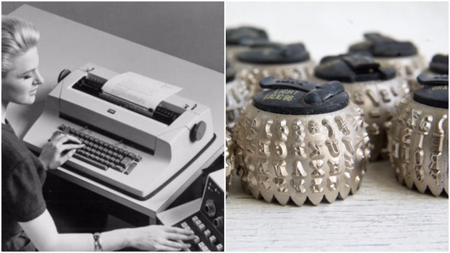
Conventional typewriters used a basket of type bars that strike the page when the corresponding key is pressed. They jammed often.
Then, in 1961 IBM introduced the Selectric typewriter, which instead used a golf ball-shaped type head, shown above right, that turned the appropriate character into position based on the user’s typing. It rarely jammed, and more importantly, the type heads could be easily switched out to change fonts (including, say, to bold or italic).
For the first time, an individual typist could use multiple fonts for a single document. The demand for this sort of flexibility—and more—paved the way toward the desktop publishing interfaces we now use.
Daisywheel printing
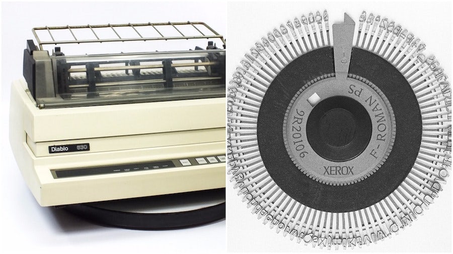
At first glance, daisywheel printers (named after the flower-like shape of the main component) might seem like a slight innovation upon the Selectric. They replace the spherical type head with a disk with radial spokes (shown above right), which was lighter and more efficient, thus improving typing speed by a factor of two or three.
But in fact, the improvements were more significant. For one thing, the daisyhead mechanism allowed for proportional fonts—where different characters occupy different amounts of horizontal space depending on their shape—for the first time in a personal typewriter.
For another, the efficiency of this method was so great that the world of computing adopted it wholesale. Before graphical user interfaces, some computers would create print outs using daisywheel printers. Well after the introduction of laser and dot-matrix printing in the late 1970s, the daisywheel remained the primary printer mechanism because of its relative affordability. Even after its time had passed, landmark digital devices like the Apple Laserwriter emulated its command set.
Phototypesetting
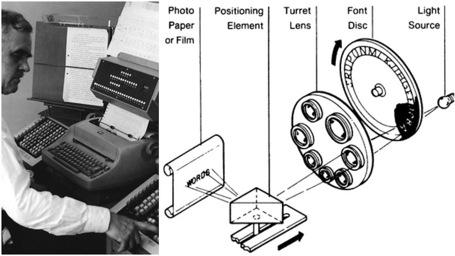
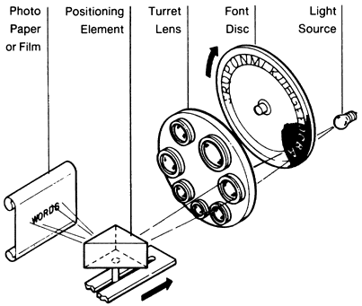
In the sphere of mass-production printing presses, the major innovation was phototypesetting, first introduced in 1949 by the Photon Corporation in Cambridge, Massachusetts. This method replaces lead type molds, or “slugs,” with the ethereal substance of light.
This is how it works. An operator projects light through a “font disc” with character cut outs. The operator then selects a magnifying lens to determine the size of the projected character. Finally, the projection falls upon light-sensitive photo paper or film, and like magic, the typed words appear. This film can in turn be used to create an off-set mold, which can be inked and reproduced again and again.
The Digiset machine
Ultimately, phototypesetting is just as “analog” as the old-fashioned printing press of Gutenberg’s day. The only difference is that wood or lead molds are replaced by the relatively high-tech media of light and chemically treated paper.
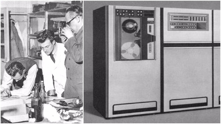
The Digiset machine, however, was a different animal. Created in the mid 1960s by the German printer Rudolf Hell, Digiset still projects light onto photo paper, but it does so via a Cathode Ray Tube (CRT)—the same technology that televisions used.
The big difference is that in this case, light is not being projected through a physical character cut-out. Rather, the light is distributed into tiny points—the equivalent of pixels—that are projected in the shape of the selected letter, which is formed using a grid in what would come to be known as bitmap format. In other words, it was digital.
What is more, CRT’s had an editing terminal that made it easy to go back and correct mistakes. Since the information was digital, the documents could even be saved on floppy disks once these came on the scene. The Digiset machine was thus a forerunner to desktop publishing programs on personal computers. It was just way, way bigger.
Fonts go digital
_
The advances in printing technology necessitated complementary changes in the practice of typography. In striving to adjust to the requirements of the new machines, typographers like Adrian Frutiger created the predecessors to modern digital fonts.
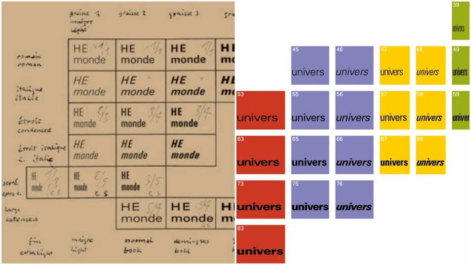
Univers
While phototypesetting had plenty of advantages, it also had its setbacks. Projected light was never going to be as crisp as a hard-formed letter mold, so the manufacturers called upon the world’s best typographers to create fonts that more carefully differentiated letters from one another.
One of the the most famous examples is the Swiss typographer Adrian Frutiger’s Univers. The aim with Univers, created in the mid 1950s, was to supersede Futura as a sans serif for phototypesetter machines. For Frutiger, the result was a product of necessity, not of art:
“The fonts [I redrew] don’t have any historical worth … to think of the sort of aberrations I had to produce in order to see a good result on Lumitype! V and W needed huge crotches in order to stay open. I nearly had to introduce serifs in order to prevent rounded-off corners – instead of a sans-serif the drafts were a bunch of misshapen sausages!”
Yet some thirty years later, Univers wound up becoming much more: a model for the emerging world of digital type. Testimony to its prominence is the fact that Univers Condensed was Apple’s keyboard font for macs all the way up to 2003. Frutiger probably was not thrilled.
Digi Grotesk
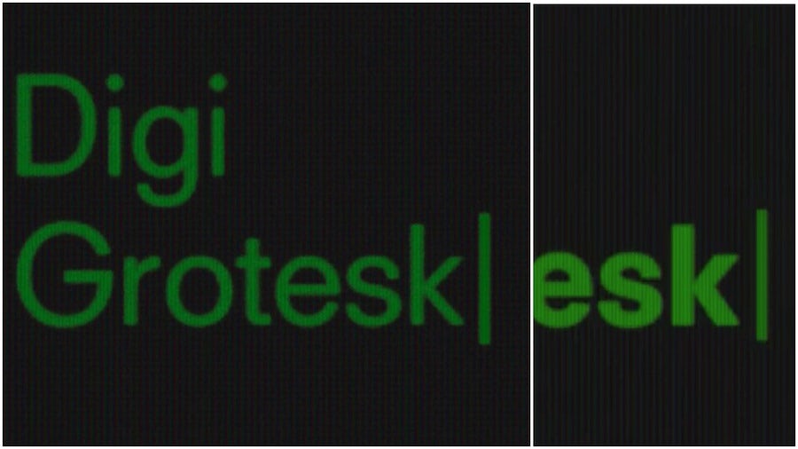
The first proper digital font came out of Rudolf Hell’s workshop. His CRT-based Digiset machine required digital fonts to be designed using points of light on a grid—i.e. in bitmap format—that would still look good. The result was Digi Grotesk (grotesk meaning sans serif), shown above in its normal and bold forms.
Considering its trailblazing status, Digi Grotesk looks great. A heck of a lot better than the blocky bitmap fonts which emerged in the 80s. The reason for this difference is that the later bitmaps had to deal with the extremely low resolutions of early PC monitors. Hell’s enormous Digiset machine was comparably high-res.
Optical Character Recognition
Another key moment on the cusp of digital typography was the movement to improve OCR—Optical Character Recognition—in the late 1960s and early 1970s.
OCR is the mechanism by which a machine such as a computer recognizes printed characters and converts them into digital information that can be stored. This sort of information processing capacity was important to industries like banking as well as government agencies.
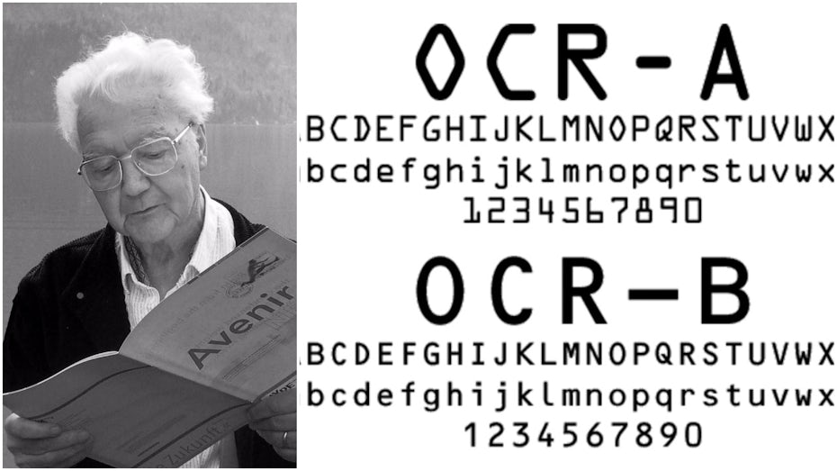
In the days of primitive computers, OCR required a typeface in which every letter was completely distinct from every other—so the computer would not make any mistakes—while still being recognizable as conventional letters to the human eye. The initial result was OCR-A, a joint project of 23 American type foundries in 1968. You might recognize this typeface, because it is still sometimes the one that appears on things like International Standard Book Numbers (ISBNs) and passports.
Europeans were not so thrilled with this American solution, however, so in the 1970s they hired Frutiger (shown above left) to design an update. The resulting typeface, OCR-B, still meets the machine recognition requirements while hewing closer to human aesthetic standards.
The personal computer arrives
_
By the mid-1980s, the personal computer was clearly revealing itself to be the next big thing. This meant more everyday people interacting with digital interfaces, and all of the typography problems that come with that proposition. The solution required revolutions not only in computer hardware and software, but that of printers too.
PostScript
In 1983, Apple released Lisa, the first computer with a graphical user interface, and won over graphic design-oriented geeks the world over. The only problem was that there was not much you could do with the things you designed, since the technology did not exist for transferring such complex information to the printed page. Text output was readable, but far from professional-quality status. And images? Forget about it.
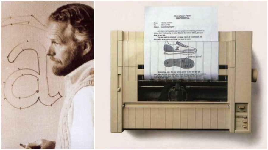
Meanwhile, a couple guys named John Warnock (shown above left) and Charles Geschke ditched their jobs at Xerox and founded a new company, which they named after the creek that ran behind their houses in Los Altos, California: Adobe.
Warnock’s big invention was PostScript, a page description language that did exactly what Apple needed: it converted font information for digital display into font information for printing a smooth, vector-curved output. The results, at 300dpi, were promoted as “typesetter quality.”
Especially after the introduction of the LaserWriter (shown above right), Apple’s first decent printer, Apple was in the graphic design business.
PageMaker
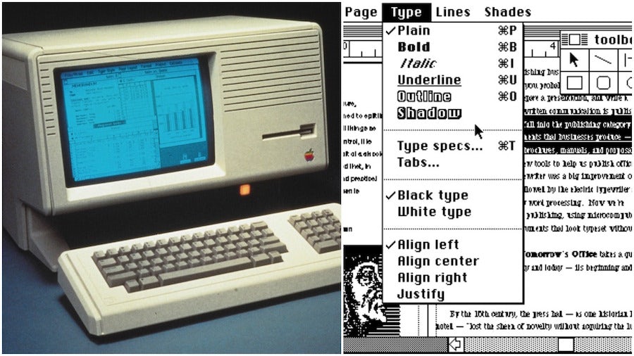
The third necessary component was better on-screen design software. Enter Aldus, a company later acquired by Adobe, and its program PageMaker, the first ever desktop publishing program.
True Type vs. Open Type
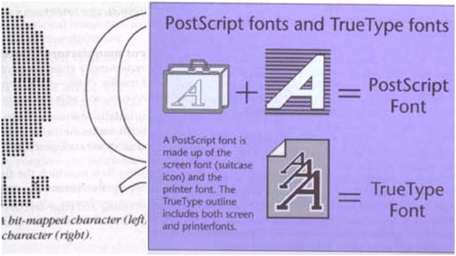
Adobe offered to integrate PostScript into both Apple and Microsoft operating systems, but at a steep price. In response, the computer companies declined and joined forces to create their own font and page description software.
The result was True Type (.ttf, or “True Type Flavor” format), a scalable, vector-based font technology. It combined what were previously two font files, one for computer display and one for print output, into one.
Unfortunately, few foundries were willing to release TrueType versions of their digital fonts, because Adobe’s software was the more trusted entity. Consequently, many of the TrueType fonts that hit the market were homemade and amateurish, harming the software’s credibility.
In 1996, Adobe and Microsoft shocked the industry by announcing that they would jointly develop a new font format merging PostScript and TrueType. This format was called OpenType (.otf, or “open type flavor” format). In 2007, almost 90% of all fonts sold were OpenType fonts.
Today’s fonts take form
_
With the necessary printer hardware and graphical user interface software in place, the burden fell on typographers to meet the challenge of designing attractive and readable computer-based typefaces.
Father Robert Palladino
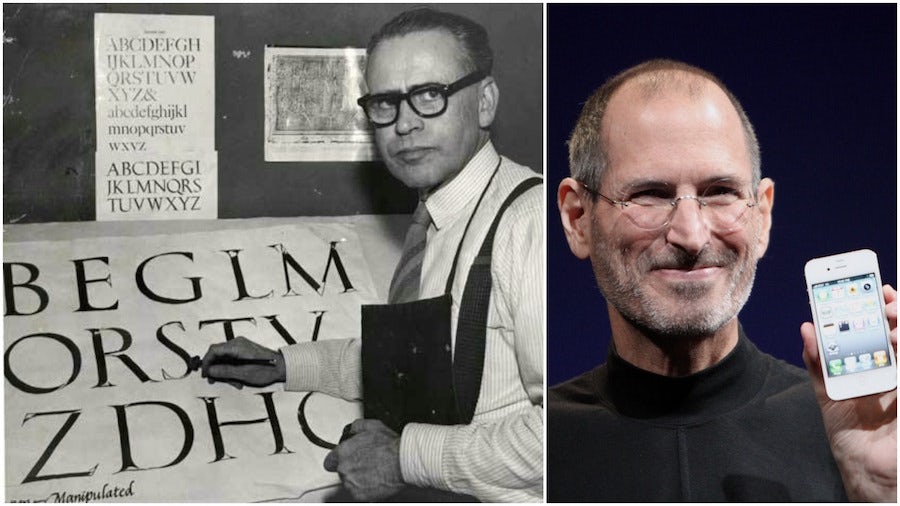
Incredible as it sounds, Steve Jobs may have owed the success of Apple to a Trappist monk calligrapher, Father Robert Palladino, whom he met during the year he studied at Reed College in Oregon.
According to Jobs, Palladino’s work at the campus calligraphy studio taught him some valuable lessons about the importance of aesthetics and design—the elements considered to have given Apple its edge over PCs. In 2005, Jobs told an assembly of students at Stanford University what he gained from his experience with Father Palladino:
”I learned about serif and sans serif typefaces, about varying the amount of space between different letter combinations, about what makes great typography great. It was beautiful, historical, artistically subtle in a way that science can’t capture, and I found it fascinating.”
Six years later, when Jobs began work on the Apple Lisa, he laid out some core requirements: it had to have plenty of fonts, and they had to be proportional. The monospaced clunkers we associate with early computing would be a thing of the past.
Susan Kare
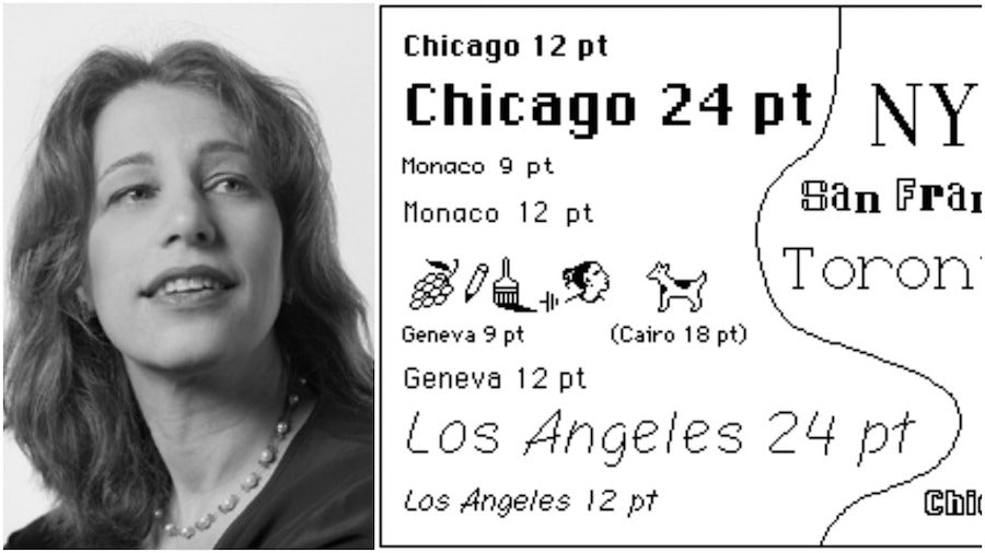
To make his aesthetic dream a reality, Jobs hired the art historian and designer Susan Kare. Besides designing the original suite of icons for Apple’s graphical user interface, Kare designed a series of proportionally spaced bitmap fonts named after famous cities.
The fonts are supposed to reflect the character their namesake cities. Thus, Chicago is big and bold, and Geneva approximates the look of Swiss typography.
Of course, Kare’s work would be effectively rendered moot with the arrival of Adobe’s smoother, vector-based digital fonts. So instead of “Chicago,” “Geneva” and “Los Angeles,” we are more familiar with the fonts that came with the original PostScript program: Courier, Helvetica, Times and Symbol.
Myriad
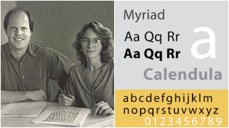
Robert Slimach and Carol Twombly (above left) designed Myriad, a sans serif distinguished by the unusual descender of its “y,” for Adobe Systems in 1992. It is definitely a font in the Frutigerian tradition—made to be readable in digital environments—though Frutiger himself apparently has mixed feelings about it, reportedly saying it is “not badly done” but that it goes “a little too far.”
In the 90s Myriad may have seemed an obscure oddball. Today, it is one of the most famous digital fonts on earth. Why? Because Apple adopted it as its corporate font in 2002, replacing Apple Garamond.
Verdana
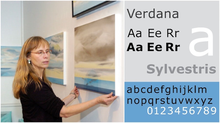
Virginia Howlett, one of Microsoft’s head designers since 1985, also recognized the need for a Frutiger-style font, and so in 1996 she commissioned Matthew Carter to design Verdana. The name is a mix of the words “verdant” and “Ana,” the name of Howlett’s daughter.
Verdana is distinguished by its tall x-height (the length of lowercase letters), wide proportions and loose letter spacing, all of which combine to make it easy to read on the relatively low-resolution monitors that were the norm in 1996.
In the retina screen world of today, however, the value of such designs has been called into question. Indeed, one might even conclude that the era of digital font experimentation, which began with the introduction of phototypesetting in the 1950s and continued through the early 2000s, has come to an end. Now, virtually any font can work as a “digital font.” A new era of experimentation can begin.
